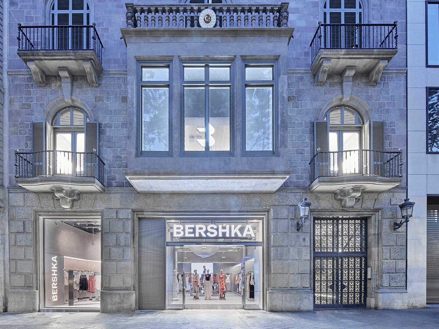
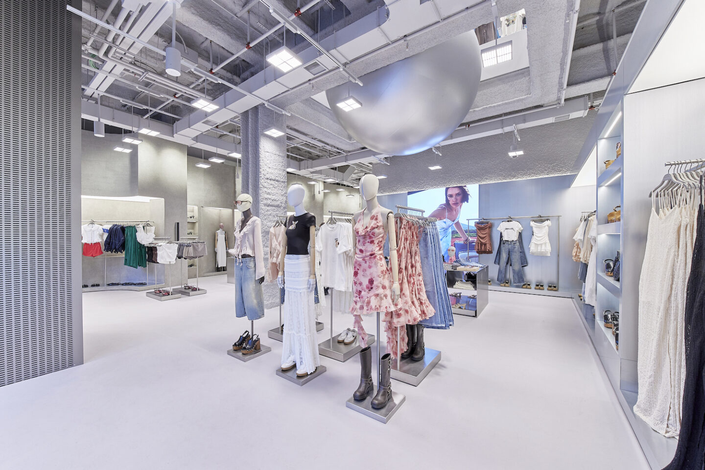
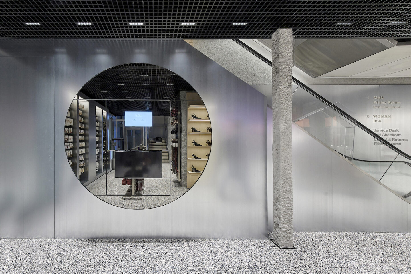
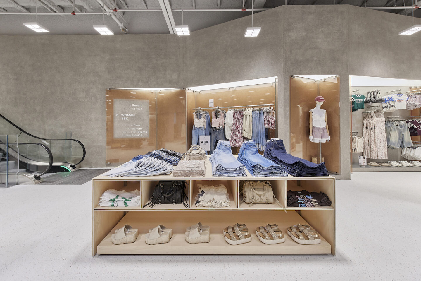
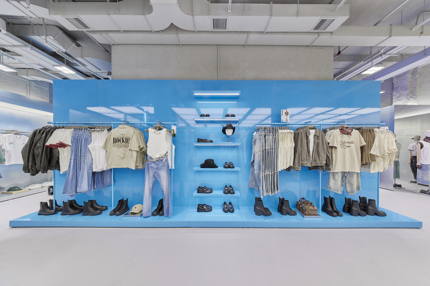
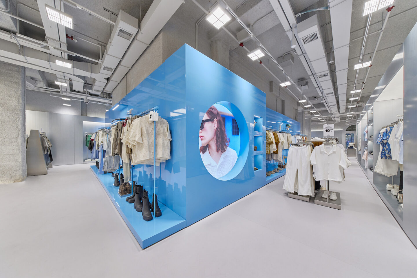
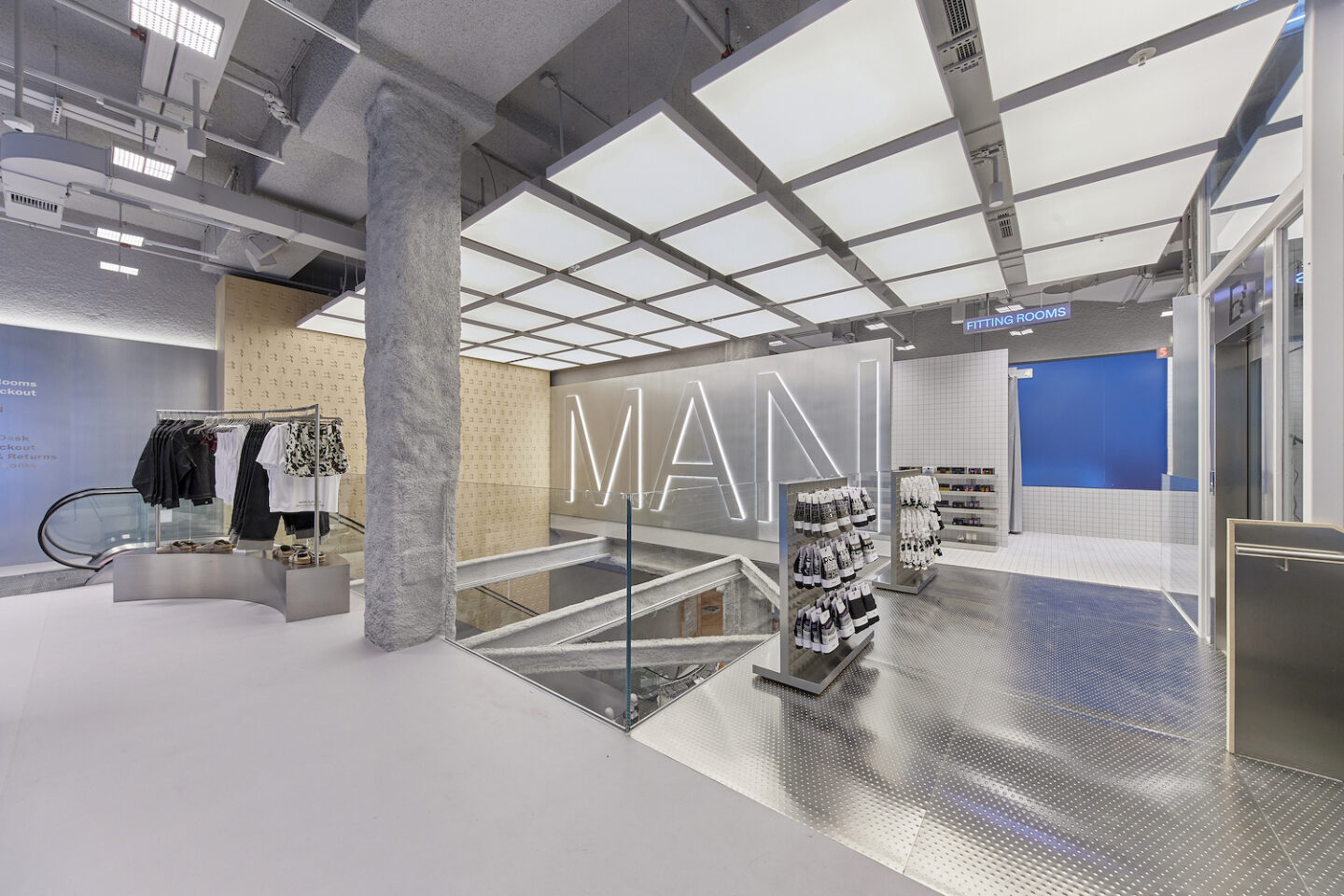
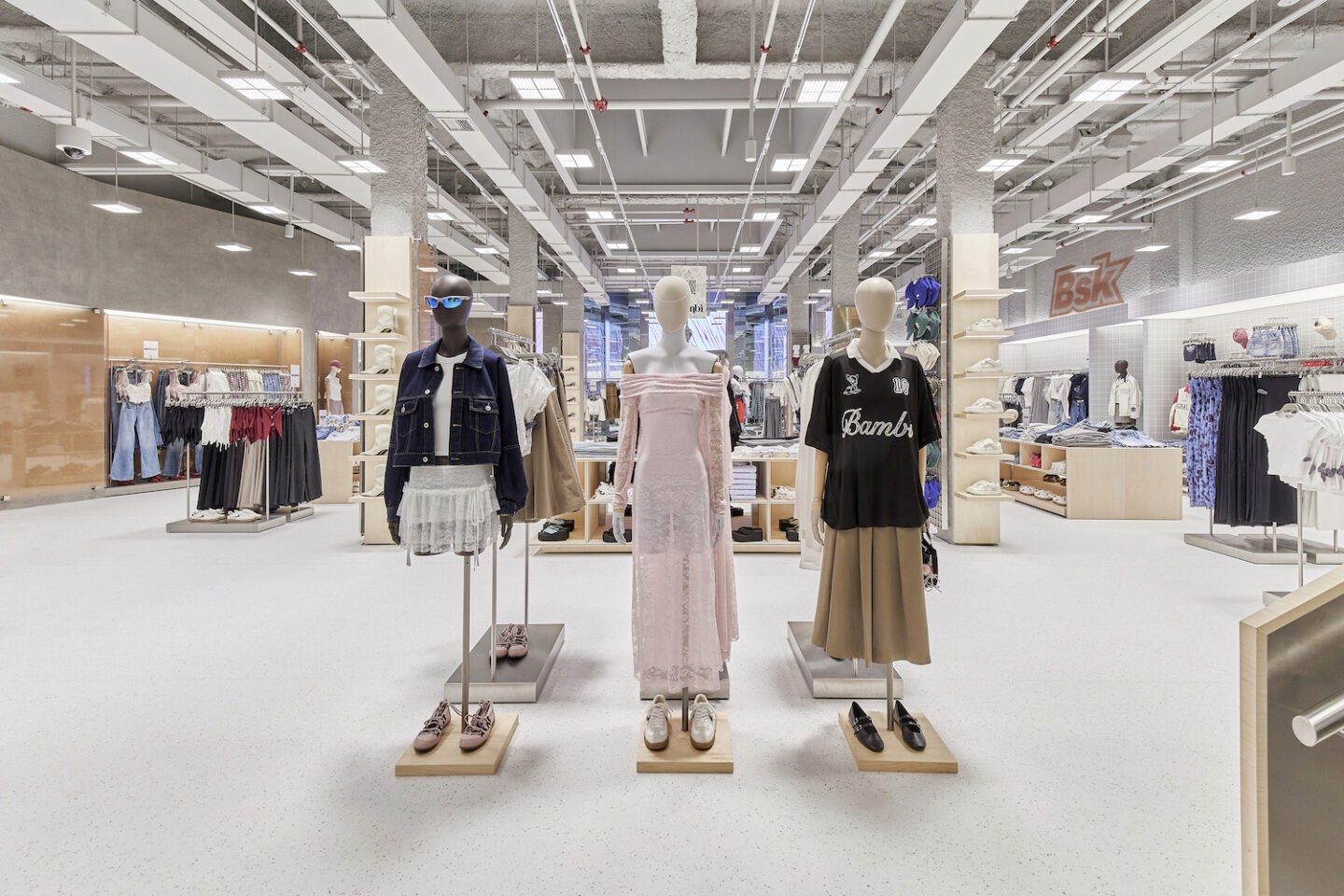
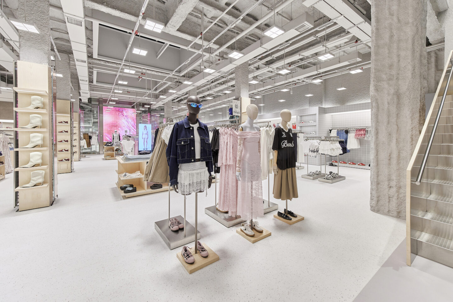
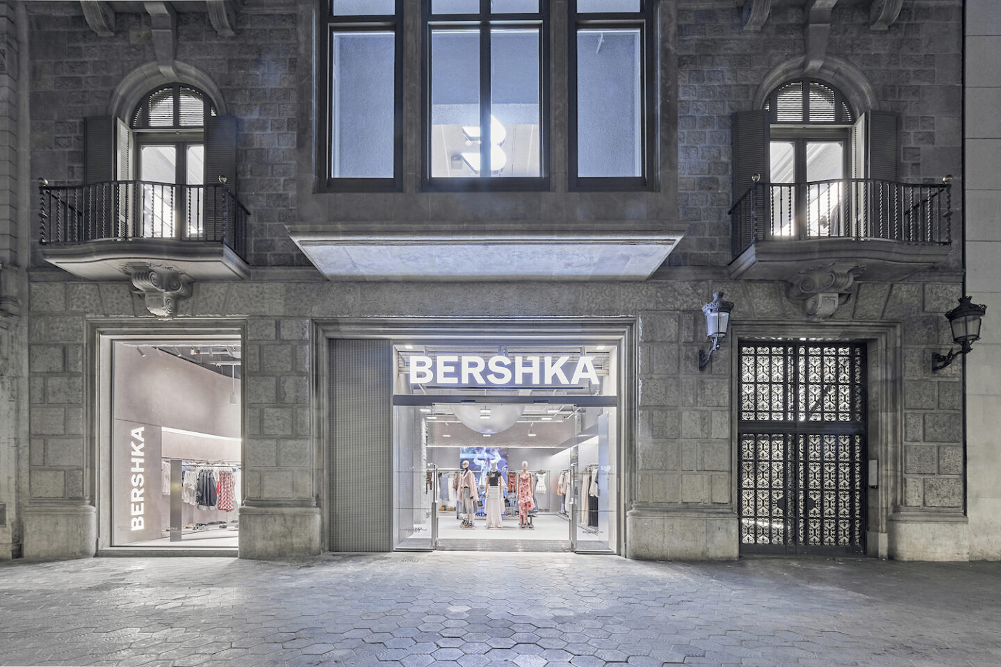
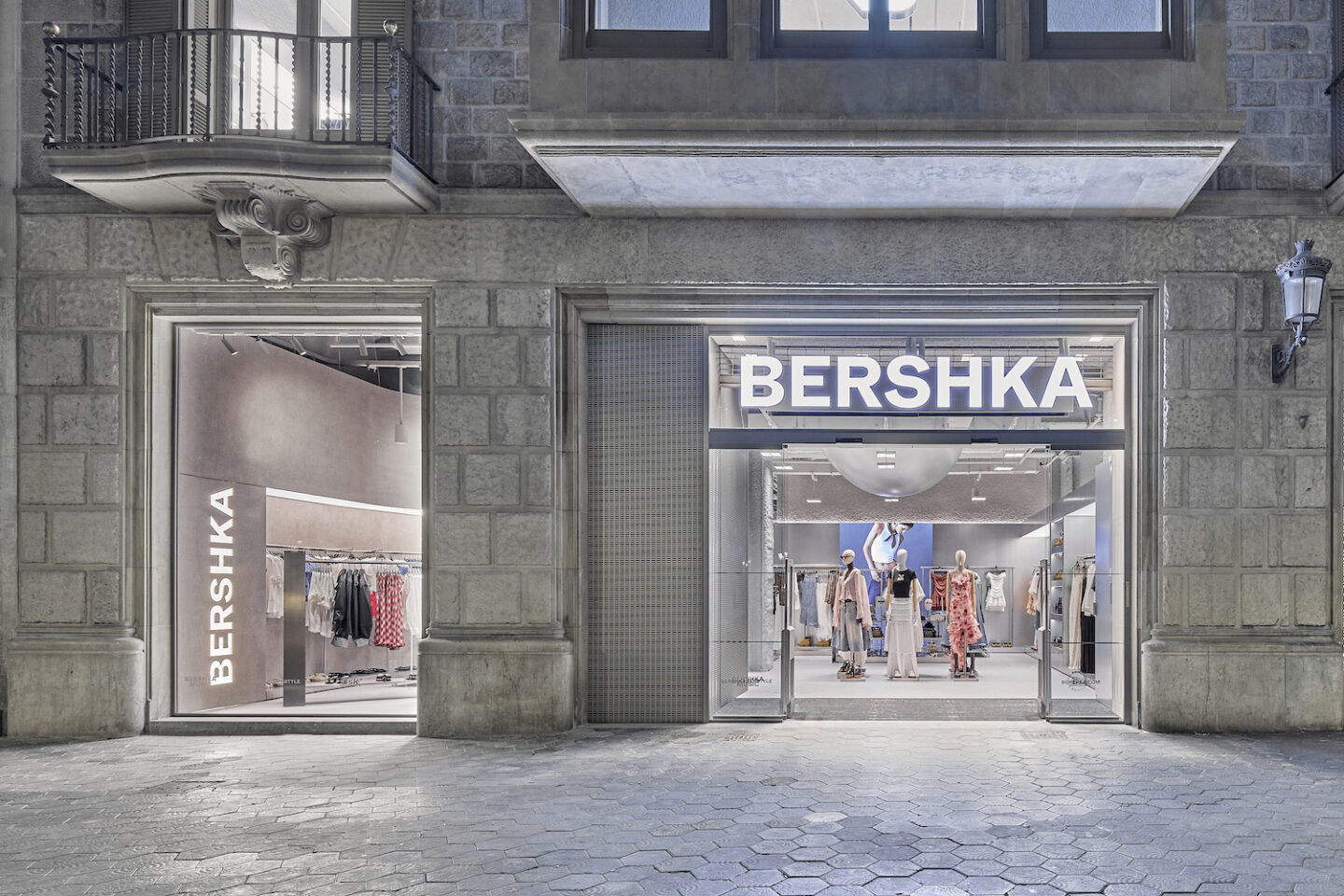
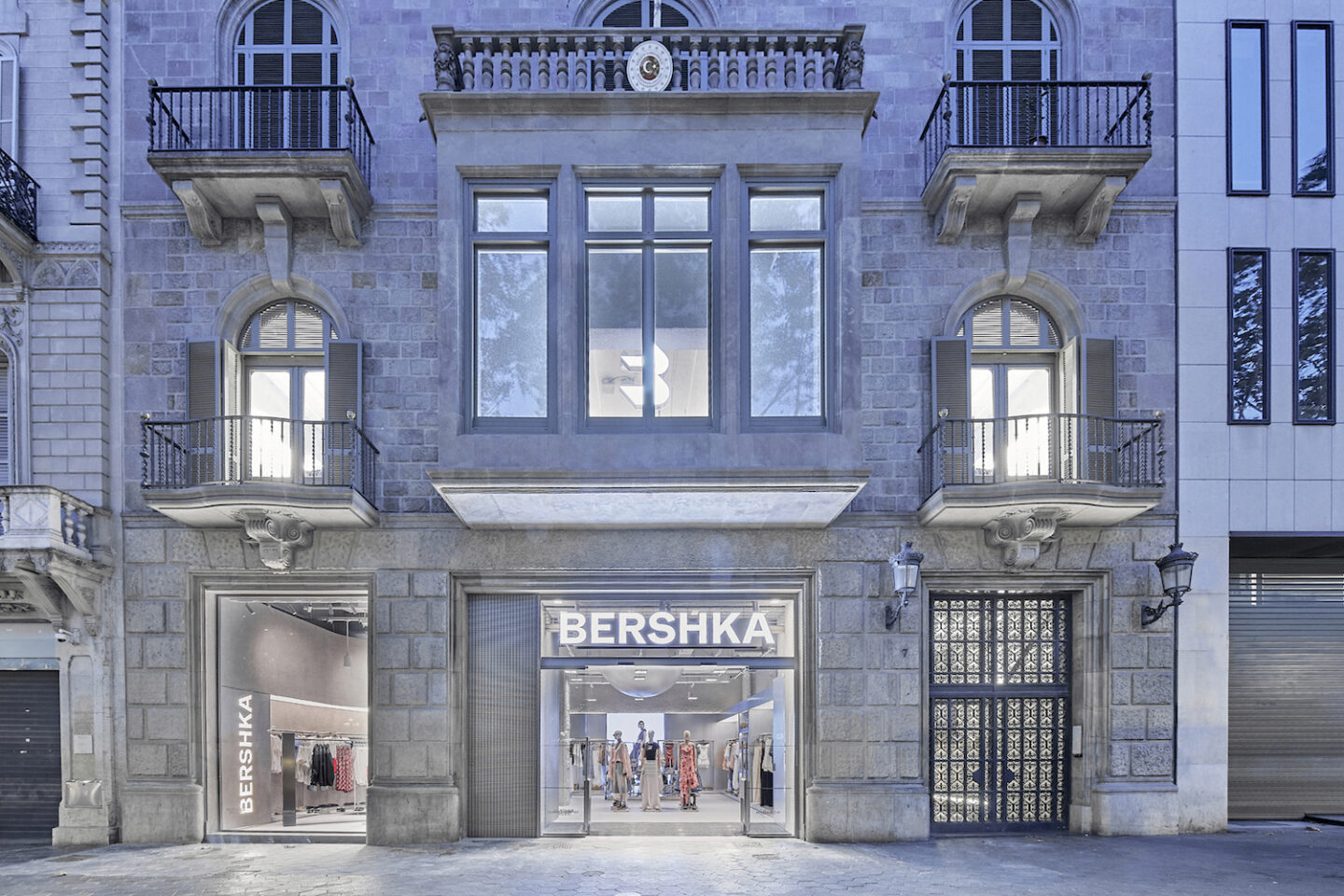
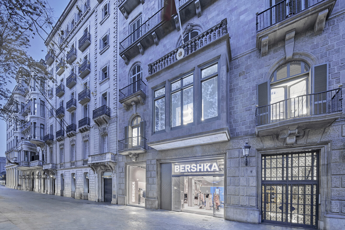
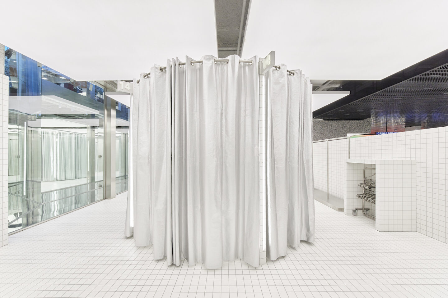
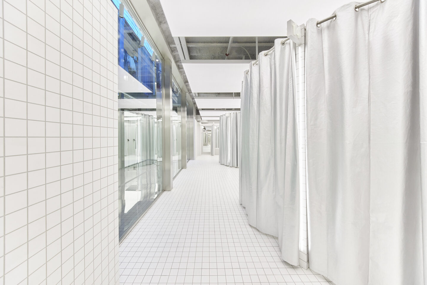
Located on Paseo de Gracia, one of the busiest shopping streets in Barcelona, BERSHKA opens one of its most important flagship stores in Spain. The 1,700 m2 shop develops its potential on three floors, housing the BERSHKA, MAN and BSK collections.
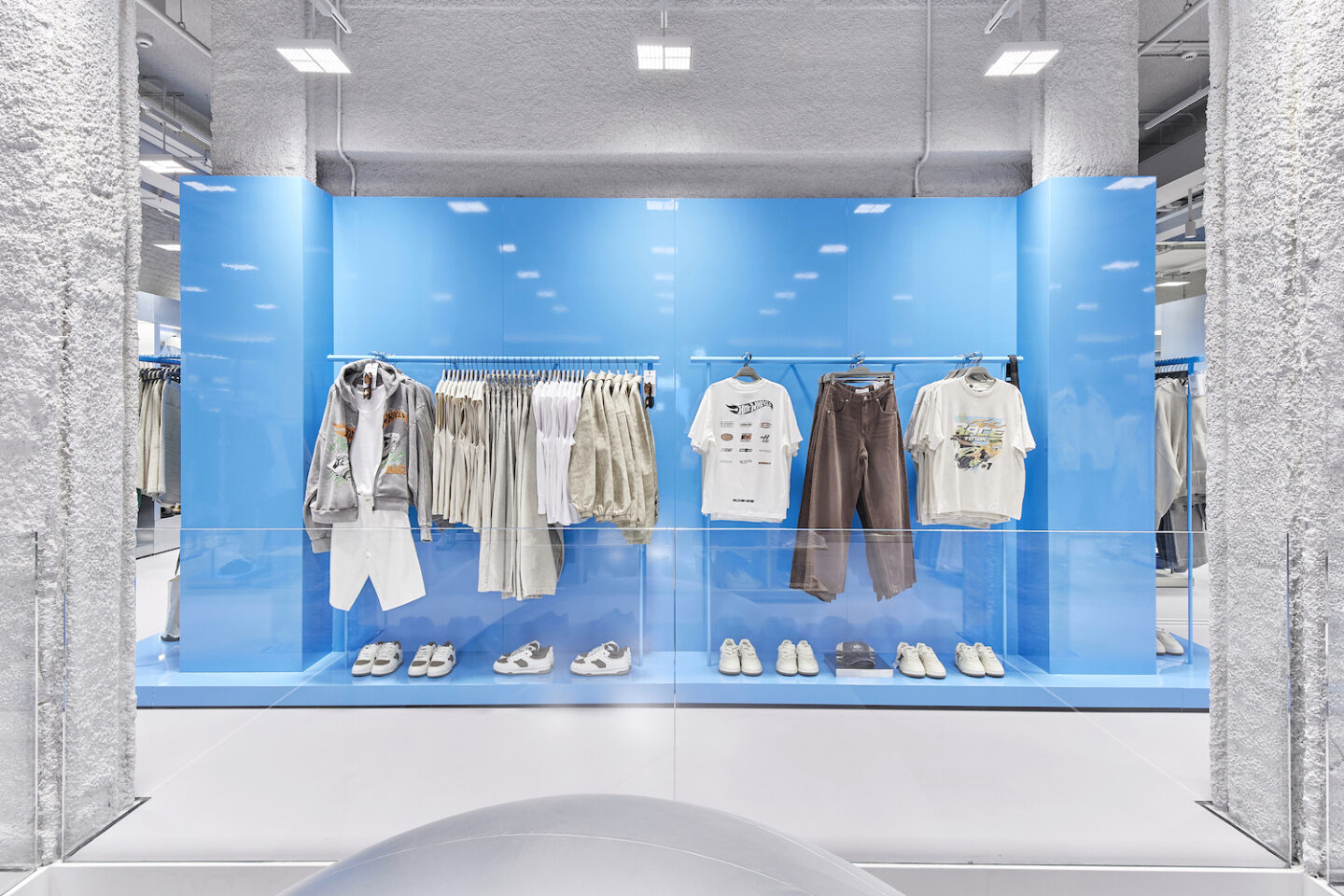
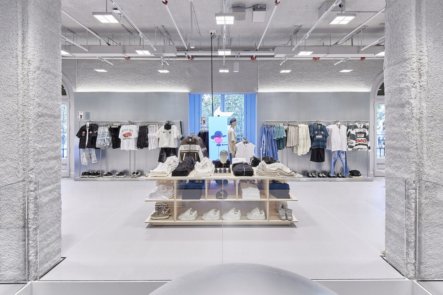
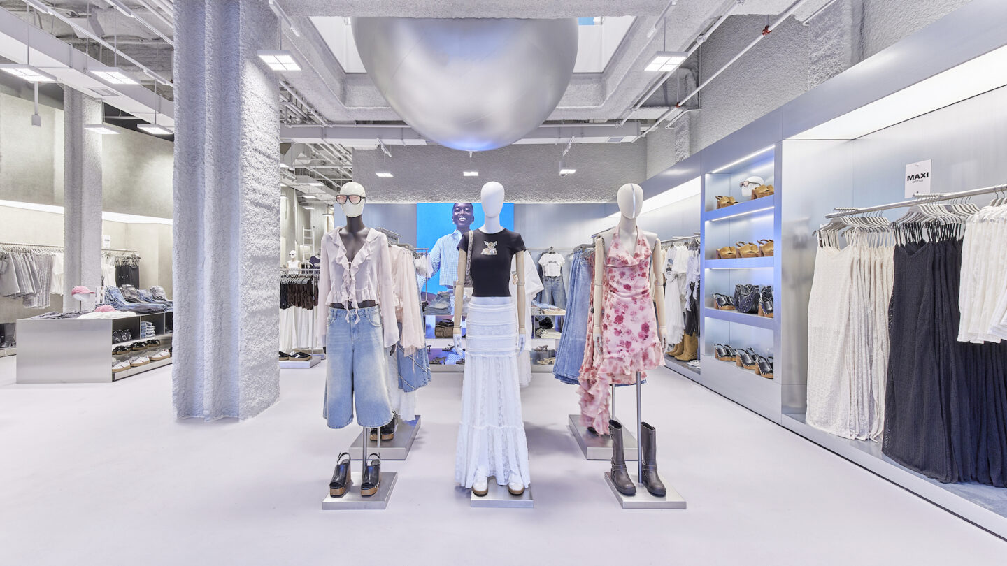
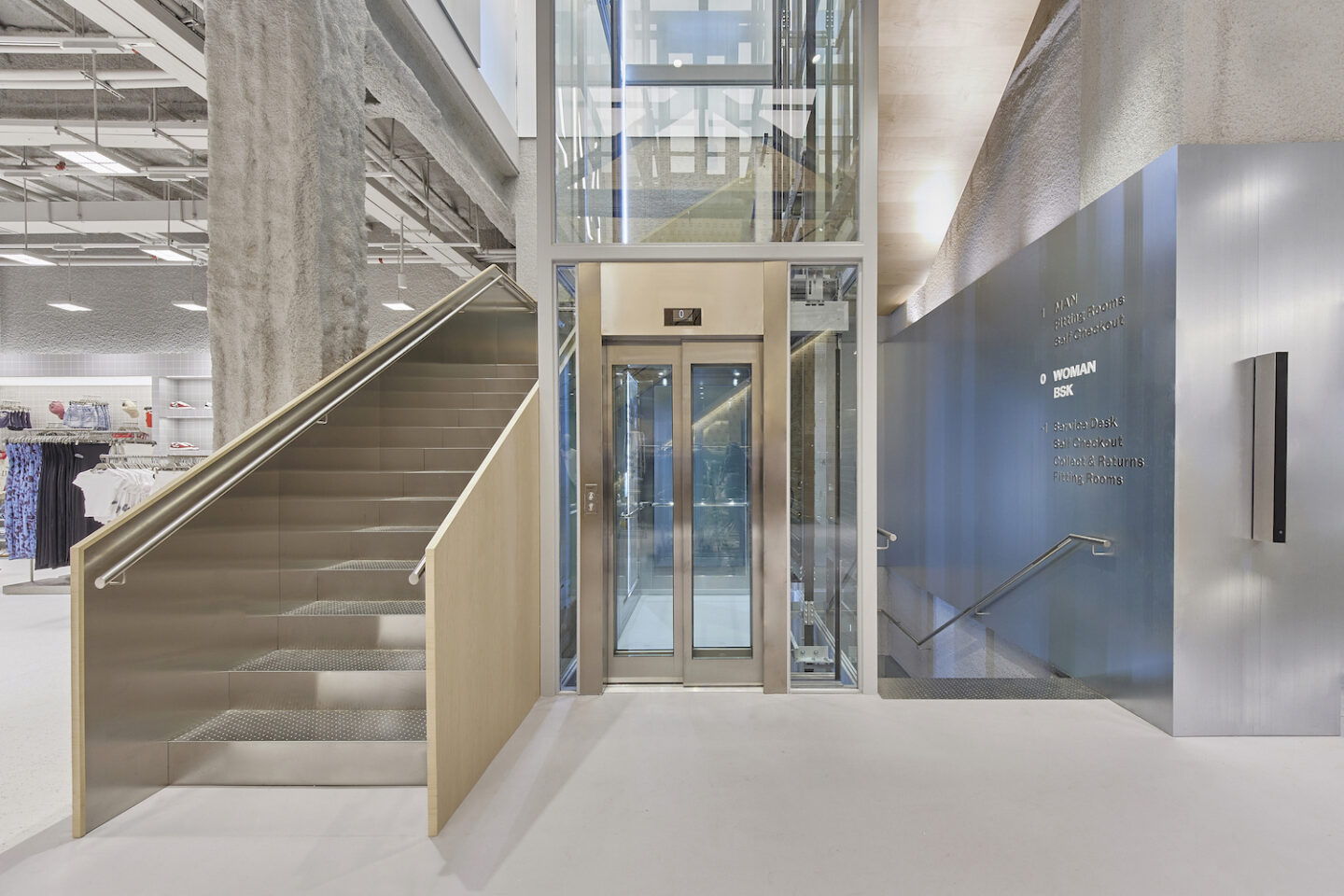
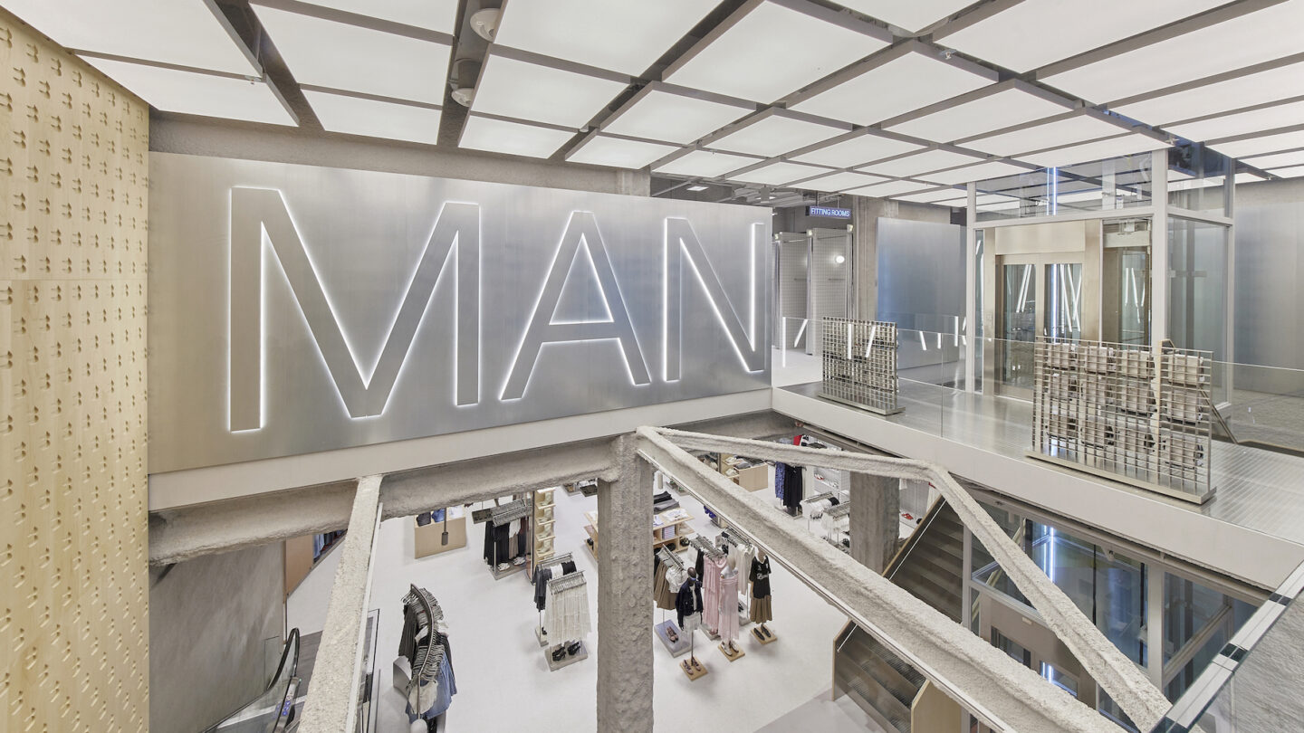
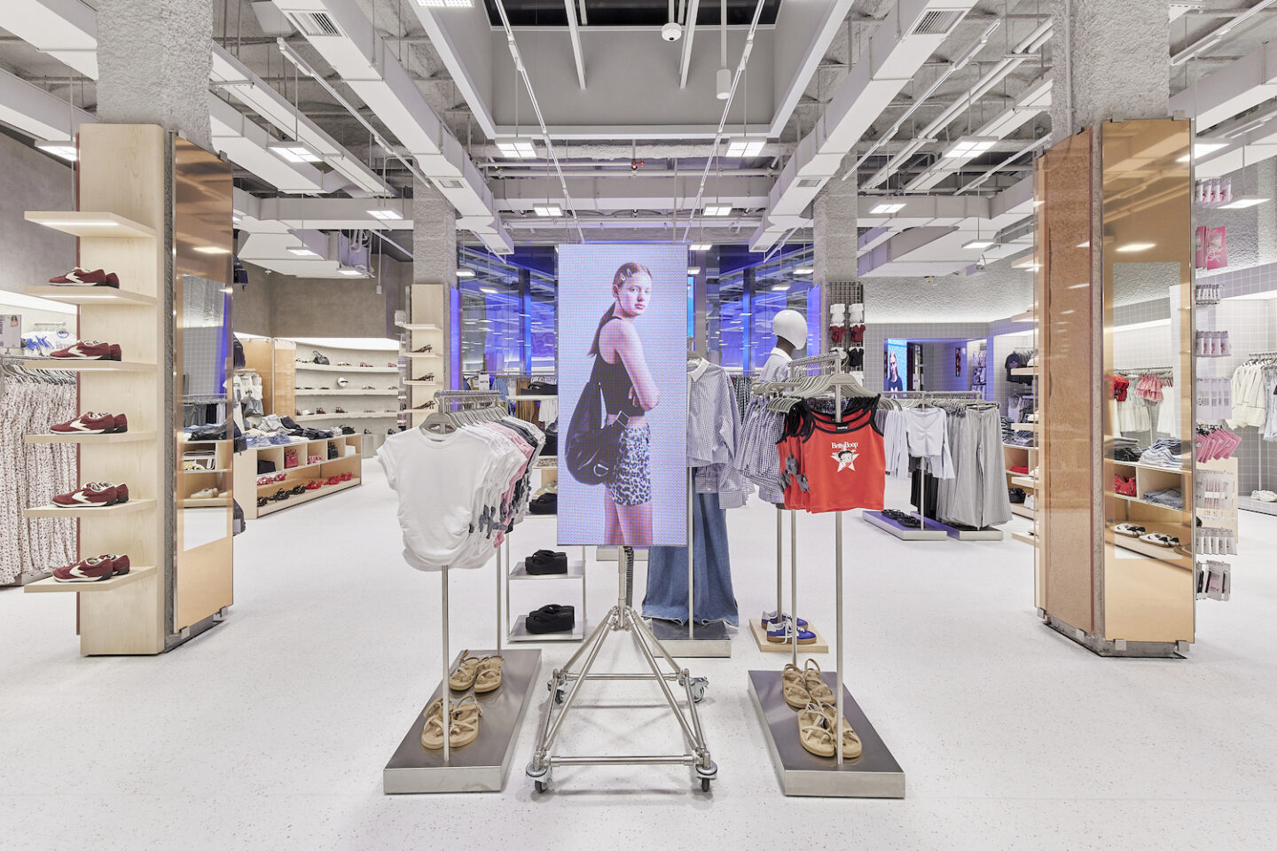
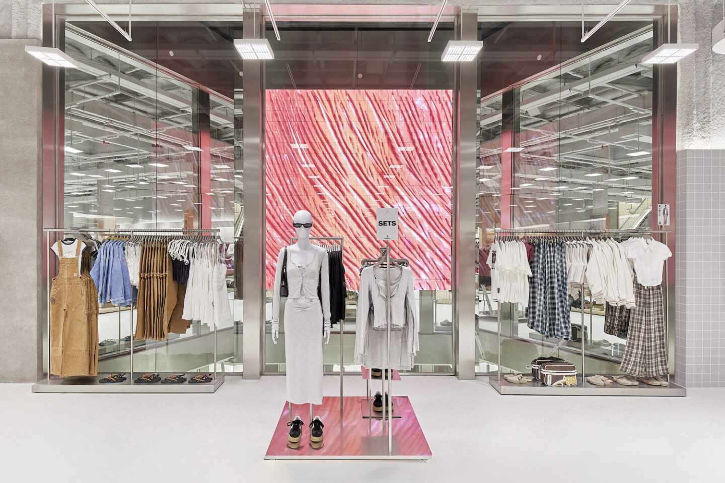
The shop concept, designed by Castel Estudio of Barcelona and the brand’s in-house design team, has sought to integrate the architecture of the building’s interior space, characteristic of Barcelona’s Eixample district. The high-rise shop is defined by traditional construction elements of the period, brick vaults, cast iron beams, metallic pillars and consists of a sequence of extremely simple product display modules that manage to organise the clothing collections by changing their materiality according to the section in which they are located, creating a dialogue with the existing architecture through their lightness. The idea of BERSHKA‘s new image is centred on the use of few materials, always very neutral, where the product and its content become the absolute protagonists.
From an architectural point of view, the spaces of the shop and its different floors have been visually connected through large openings in the floor slabs, patios and skylights, allowing the entry of sunlight and generating a very pleasant atmosphere. Surprising display elements such as a large stone wall that articulates the product display and generates a visual route through the entire depth of the shop, ending in a large courtyard of light where a large kinetic screen has been installed with content generated by the American artist Ezra Miller, expressly for this occasion.
Sigue toda la información de HIGHXTAR desde Facebook, Twitter o Instagram
You may also like...
