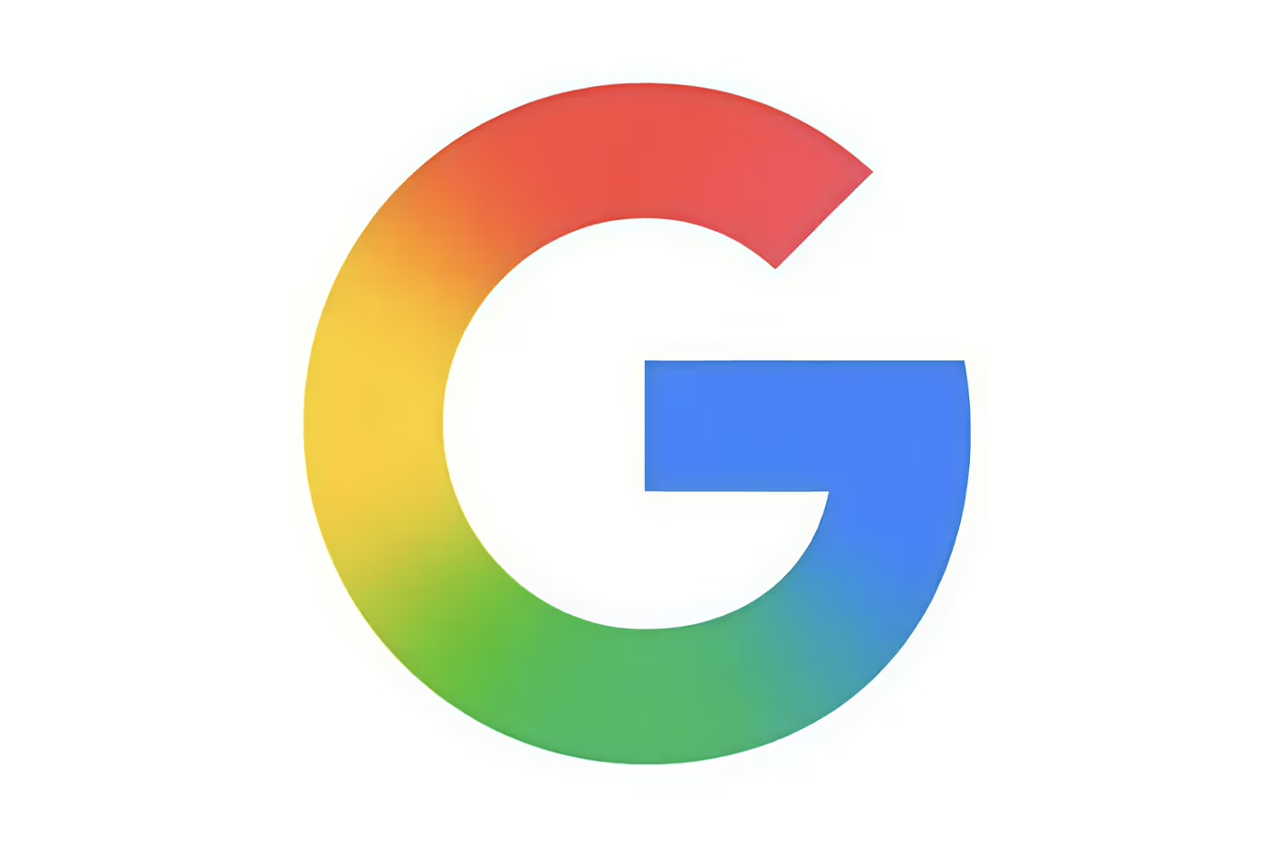
Google Google, that titan that defines how we access information in the 21st century, is giving one of the most recognizable symbols on the planet a soft refresh: its “G” logo. Nothing drastic. Nothing outrageous. But subtle enough to make us look twice.
The classic four-color palette—blue, red, yellow, and green—is still present, like a visual capsule of techie nostalgia. But now, the letter features a more open, more fluid shape, more aligned with the post-flat design that dominates the digital scene. What’s changing? Readjusted curves, softened proportions, and a cleaner finish that feels just as familiar… but more modern.
It’s not a radical rebranding. Rather, it’s a surgical recalibration that maintains the essence while adapting to the new generation of screens, interfaces, and UX vibes. The “G” is reinvented without losing its DNA.
This silent evolution—already visible on Pixel devices—marks the first major visual update since that typographical leap to Sans-Serif in 2015. Almost a decade later, Google is blurring the lines between colors to make them flow and merge. A forward-thinking aesthetic decision, designed to perform in all formats, from smartwatches to Augmented Reality.
In times when design is also discourse, Google is telling us something without saying it: we’re still here, we’re still evolving, and yes, we’re still setting the pace.
The stylistic transformation of the most Googled person on the planet, aka Bianca Censori.
Sigue toda la información de HIGHXTAR desde Facebook, Twitter o Instagram