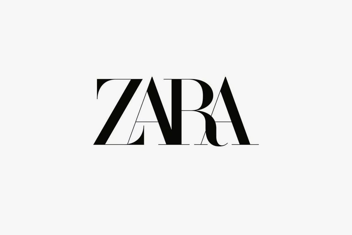
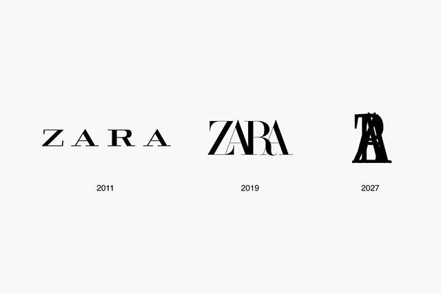
For the second time in its 45-year history, Zara has changed its logo. Unexpectedly, the national fast-fashion retailer par excellence has replaced its recognizable, spaced brand with a new image that plays with superimposition on its website and social media accounts.
Designed by advertising agency Baron & Baron, the new logo connects the letters of Zara and adds accented curves to the “Z” and “R”. This is the second time the Inditex retailer has changed its logo, the first time in 2010 with the addition of spacing. The new superimposed image seems to come from the French publisher, artistic director and founder of Baron & Baron.
From our point of view it’s not the best adaptation Zara could have made. And it seems that we are not the only ones who think this way because the memes have already started to circulate.
If you want to know more about the boom in logo changes in the fashion industry read this.
Sigue toda la información de HIGHXTAR desde Facebook, Twitter o Instagram
You may also like...
