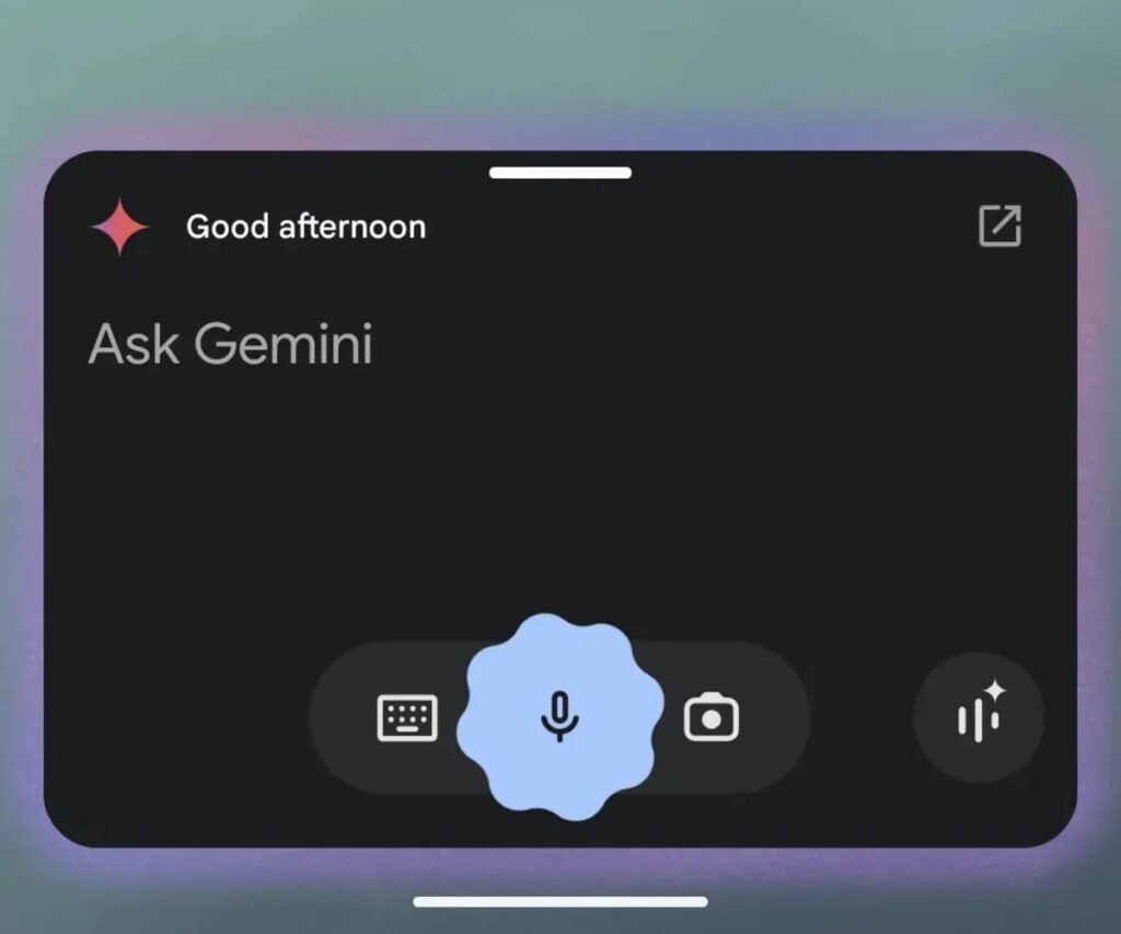
Google has just raised the level of interaction on Android with the redesign of Gemini, transforming the virtual assistant experience to a new plane of minimalism and efficiency. What was once a rectangle with rounded corners has been replaced by a much more compact, cleaner and functional interface. Goodbye to the initial greeting, goodbye to the characteristic flash in the top left corner. Now everything you see is pure utility.
This new look focuses on the essentials. The ultra-minimalist interaction bar features a small ‘plus’ button on the left, next to the text ‘Ask Gemini’, while the circle for voice input glows in a purple-blue that stands out on your screen like a signature of its own. It’s as if Google has decided to give the system a facelift without losing the essence of what makes it so efficient.
But what really changes here is not just how it looks, but how you interact with it. The new interface, much more integrated with the system, now looks more like a Google search bar, albeit without the frills. This revamp is part of a more functional approach that also goes hand in hand with the integration of new capabilities, such as PDF document parsing. Google is not only caring about what you see, but also what it can do for you. A visually appealing assistant that also does more for your productivity.
The activation process remains familiar. With a long press of the power button or a swipe from the bottom corners, you can access this new version without getting lost in a sea of settings. And the best part is that, with this new interface, everything feels more fluid, more instantaneous, and on par with the evolution of the assistant.
With the new layout, Google has not only focused on visuals, but also on efficiency. The Gems system allows quick access to frequently used functions, customising them to your habits. Imagine more direct access, without having to spend time searching through menus or settings. Every movement has a purpose, and that will be noticed by the most demanding users.
The ability to switch between text, voice and camera has been simplified, and if you’re a fan of Gemini Live, it’s always available in the bottom right corner, with the touch you’d expect from a top design. Every detail has been thought through to make the experience even faster, more accurate and personalised.
The rollout of this update is gradual, because Google doesn’t want you to miss a single detail. Through this phased distribution, the company is observing user feedback, adjusting what works and what doesn’t, and finally rolling out the design globally to all Android devices. It’s all designed to feel natural when it reaches everyone.
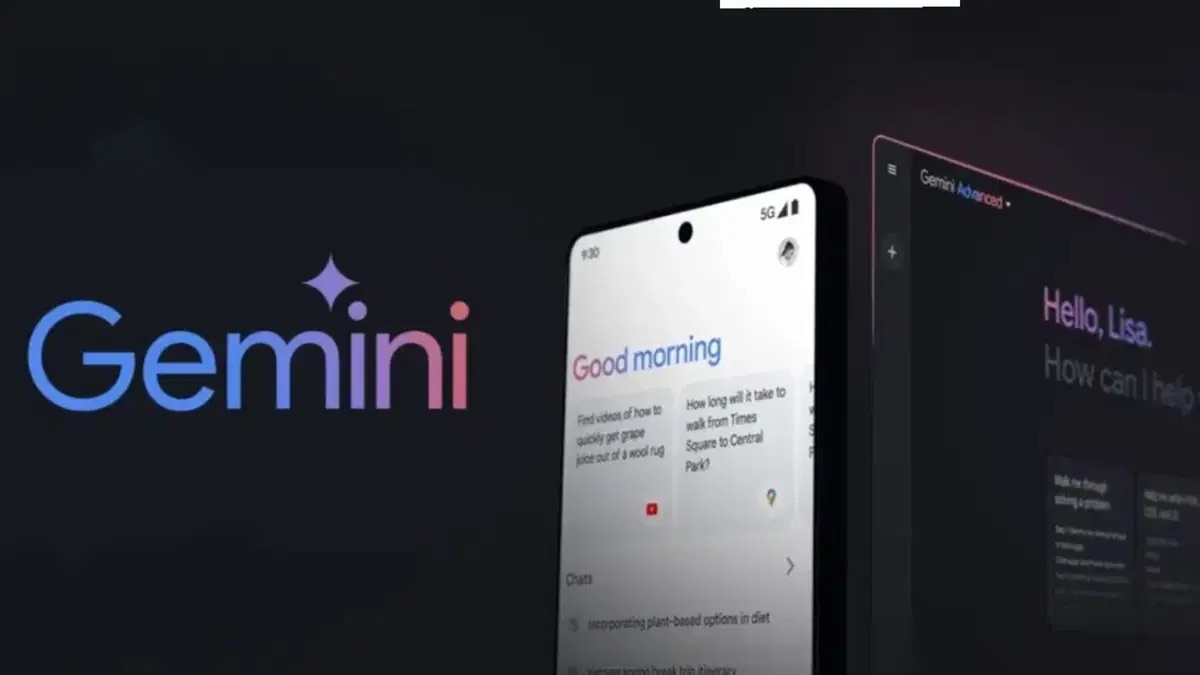
The change in Gemini has not only been aesthetic, but conceptual. If in February the interface was a battlefield of decorative elements, now it has been reduced to a minimum, leaving only what really matters: faster and more direct access to the assistant’s functionalities. All the space occupied by unnecessary details is no longer needed. And the impact is clear: an experience that flows, simpler and much more effective.

This redesign is a clear sign of how Google is understanding the future of digital interaction: fast, efficient, and minimalistic. The new compact interaction bar not only frees up space, but also makes the user experience easier and faster. This new design standard has a single purpose: to make your life easier, without being distracted by superfluous details. Google Gemini is now the assistant of the future, an assistant that is here, now and always.
Sigue toda la información de HIGHXTAR desde Facebook, Twitter o Instagram
