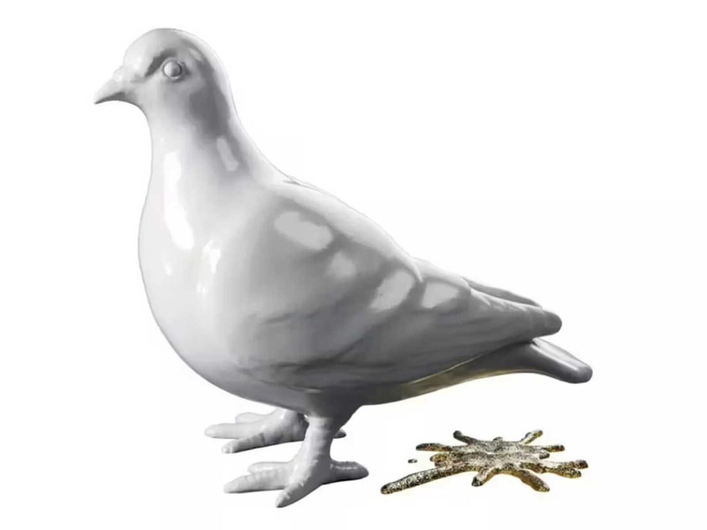
The Museum of London has unveiled its new logo as part of an ambitious rebranding effort. Well, opinions are divided on the matter. On its forthcoming move to the iconic Smithfield Market in 2026, after several delays and cost overruns, the institution will officially be renamed the Museum of London.
The new design, a white clay pigeon with a shiny golden droppings, seeks to capture the essence of the city, a mixture of “grit and glitter”, as director Sharon Ament explains to Artnet. The chief curator, Francis Marshall, points out that the pigeons, present in London for more than a millennium, are already an urban emblem.
But not everyone agrees. Maxwell Blowfield, of the newsletter Maxwell’s Museums, was critical: “In 15 years of living here, I’ve never heard anyone talk about pigeons,” he said. He also pointed out that the choice is not unique, mentioning that Paris will use a similar theme for the 2024 Olympics.
The museum, however, defends the change as a way to keep the institution attractive and relevant, reflecting the multiple realities and histories of London. The logo was designed by Uncommon Creative Studio, which consulted with 33 Londoners, including artists, chefs and museum professionals.
Ament argues that the design invites a re-evaluation of the city and its coexistence with animals. Despite the detailed justification behind the design, some remain sceptical. Blowfield: “The logo seems to lack a meaningful representation of what makes London exceptional, which is, ironically, quite remarkable”.
Sigue toda la información de HIGHXTAR desde Facebook, Twitter o Instagram
