Typography itself is a mostly abstract art. Articulated in the typographic point like music is in the notes, its history is almost as vast as its expressive possibilities. And the part of a brand’s logo that includes its name, technically called “logotype”, has the task of visually shortening all its aesthetics. That’s why logo and font changes for brands occur very rarely and, if they do, they have to be as perfect as possible.
These are the five most iconic fashion fonts, according to NSS magazine.
Prada
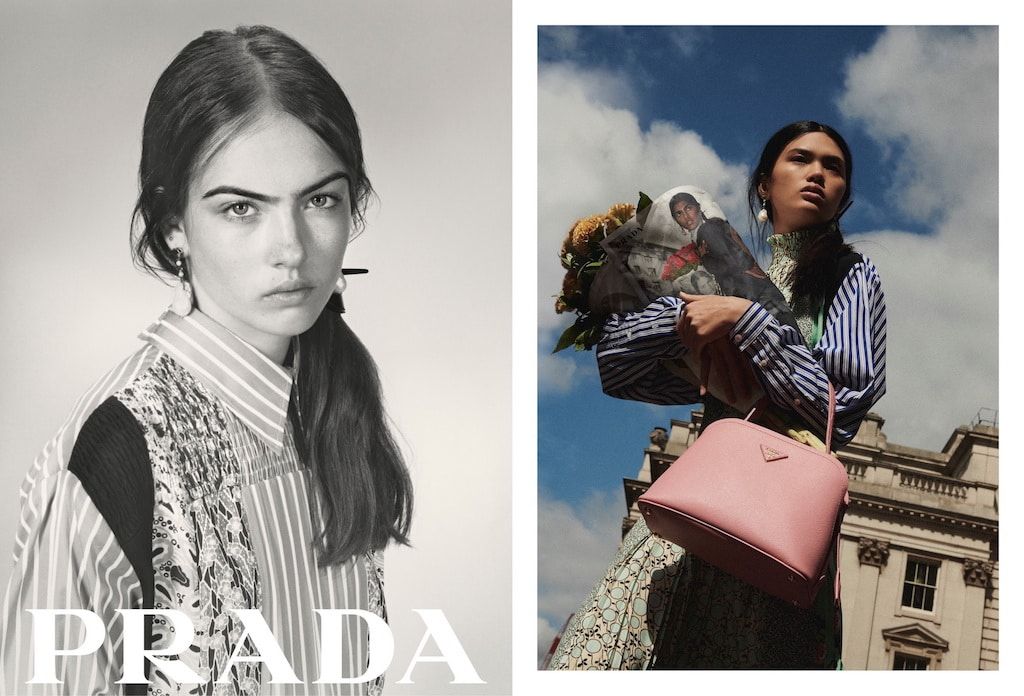
The Prada logo is a “modern serif”. Prada’s is actually a unique font, which has remained essentially unchanged since the official logo of the brand was established a few years after the opening of the original Prada store in Milan’s Galleria Vittorio Emanuele, which still retains the original “Fratelli Prada” sign with a lettering that would not be used again for decades.
Dior
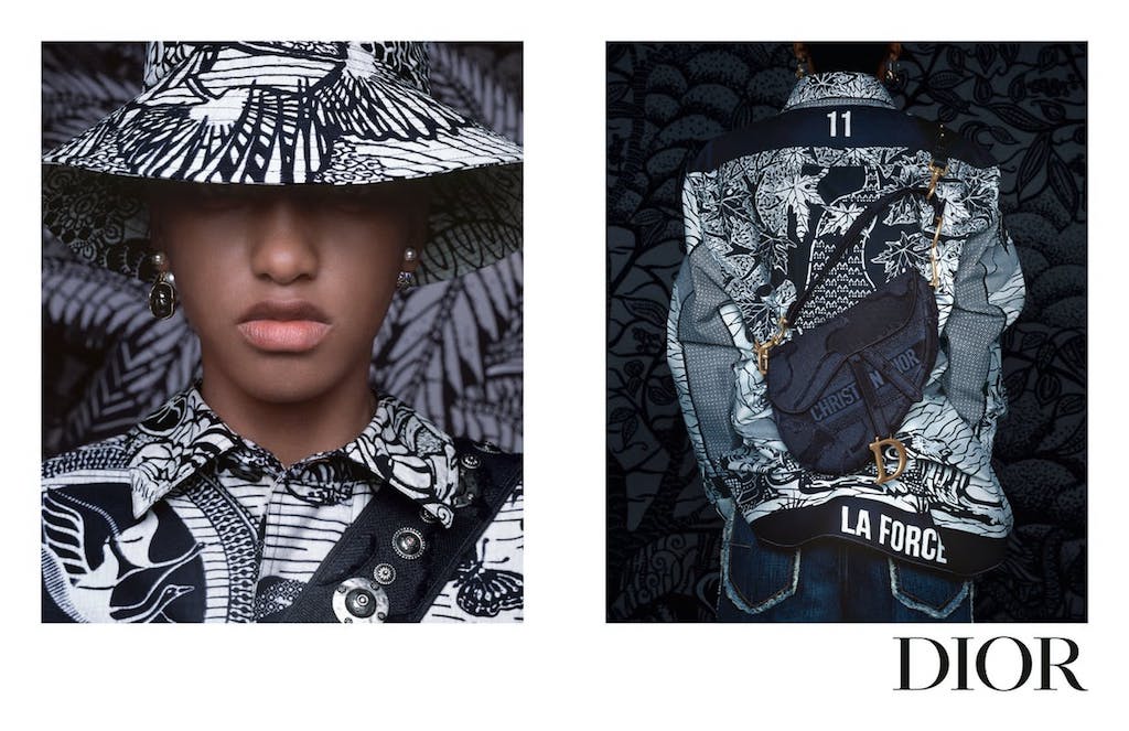
One of the simplest and most memorable logos of all time, updated perhaps three times throughout the brand’s history (once it bore the founder’s name in its entirety, while today there is a version entirely in capital letters), the Dior font belongs to the Cochin family, created in 1912 inspired by the copper engravings of the French artist of the same name. The fountain became famous around the 1920s, for its delicate and feminine appearance, and it is no coincidence that Christian Dior chose it to sign his creations.
Gucci

Although in its most recent version the characters have lost their final elongations, the font used for the Gucci logo is a Granjon Roman, inspired by the Garamond, but more rounded. It is a typeface that expresses a certain authority, classicism – after all, the foundations for it were laid in the 1500s. The font has become thinner and “softer” over the years, gaining in personality and becoming more hybrid and lighter.
Vogue
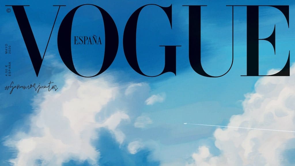
You don’t become the world’s most famous fashion publication without a source to match. Vogue magazine, founded in 1892, already featured on its first cover a still archaic version of what would later become its official typeface, established since the 1950s, the so-called Dido. It is actually a slightly modified version that changed in thickness and body over the years, but always remained fixed for the magazine. The typeface was chosen for its clean, classic and authoritative look (that of the titles of important books and treatises) but with a very modern feel given by the contrast between the fine and thick letters.
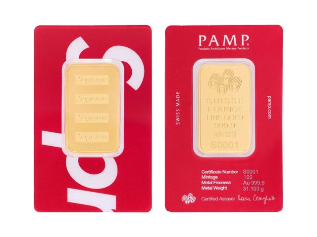
Supreme
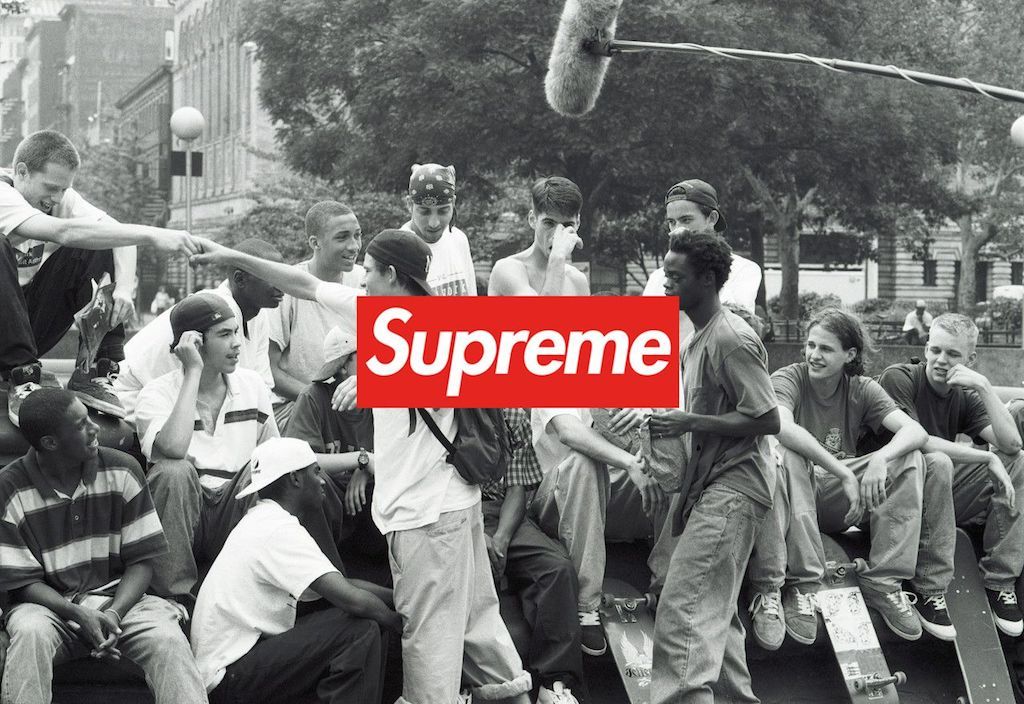
The Futura typeface was invented in 1927, in Germany, by Paul Renner. It was an incredibly modern typeface for the time, with very geometric versions, and was sold and used everywhere in the following years until it reached the dashboard of Apollo 11 and the Kubrik films. However, it was the artist of the 1980s, Barbara Kruger, who used a bold, italicized version of it for her subversive works, later becoming an icon of the New York art scene, which was later lent by James Jebbia (with Kruger’s more or less tacit approval) for his brand, which shared with the artist an irreverent look at the dominant culture.
–
via: nss
Sigue toda la información de HIGHXTAR desde Facebook, Twitter o Instagram
You may also like...