Haute couture and luxury houses are opening a new era in which the power lies in the simplification and homogenization of the logo. A minimalist trend of branding or “blanding” in which the design does not pretend to stand out, but to be part of a whole; of sort of club in harmony and aesthetic harmony.
![]()
Already in 2012 Hedi Slimane initiated this graphic movement at Saint Laurent, when he removed the Yves from its corporate identity. The transformation had only just begun, germinating a whole revolution with which to somehow “renew” or reimagine the brand’s heritage in a globalized context.
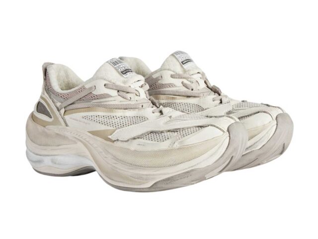
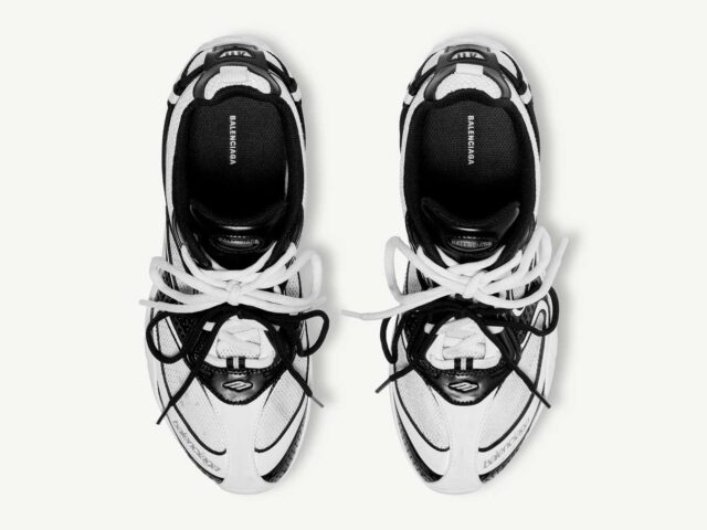
Other cult labels such as Burberry, Balenciaga, Berluti or Rimowa have also wanted to join this trend with which to give the logo a powerful and daring look through geometric treatments accentuated by clarity and simplicity.
![]()
In this same reductionist scenario, the brand name is transformed and simplified, as we saw with Hugo Boss when it became simply BOSS or Ermenegildo Zegna to act under the name Zegna.
One of the latest brands to join this contemporary twist in the sphere of branding has been Ferragamo, eliminating the cursive font used by Salvatore Ferragamo and replacing it with FERRAGAMO with typography inspired by the stone inscriptions of the Florentine Renaissance. A measured and synchronized action with the new appointment of Maximilian Davis in the creative direction, as well as the fact of betting on a brick red tone (3546C Pantone) registered with the color institute.
![]()
COLOR IDENTITY
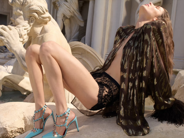
If what brands explore with “blanding” is graphic standardization through fonts such as Sans Serif, the opposite happens with identity color. The idea is to underline the DNA with a striking tone that is forever associated with the brand, and to re-code it as Balestra did a few years ago with electric blue or Valentino with the strident pink and Bottega Veneta with the patented chroma green.
Experimentation with its visual identity consists of giving it a new creative and management direction that often coincides with a new appointment or the resurrection of the label with the aim of reaching a new market niche. The desire to align with the same imaginary to connect with the collective audience persists, beyond implying a marketing and logistical improvement in the printing of the logo.
![]()
Rebranding is thus an opportunity to explore new dimensions, as if it were a kind of reset or rebirth to open a new era for the brand, without forgetting its past and heritage.
Sigue toda la información de HIGHXTAR desde Facebook, Twitter o Instagram
You may also like...