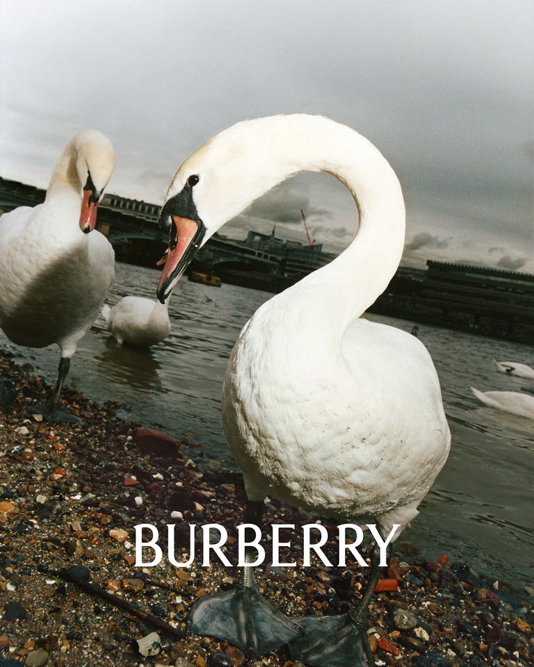
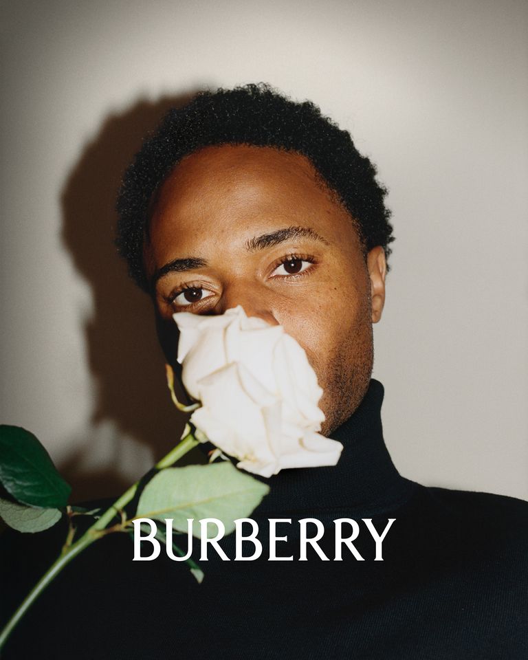
One of Daniel Lee’s first creative expressions in the creative direction of Burberry was the creation of a new logo, as a graphic movement that seems to have put an end to the minimalist trend of logo standardization within high fashion and luxury houses. Is this the first death knell for sans serif fonts?
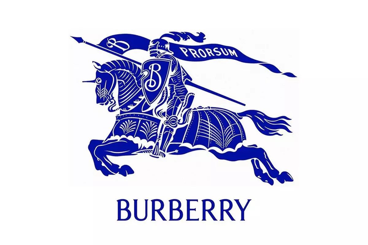
Burberry’s new logo is a remastered version of the brand’s “equestrian knight” motif, which was first used in the early 20th century. Described by the brand as “a modern take on British luxury” and “a new chapter for the brand,” Lee’s foray into Burberry seems to revive the fashion house’s ultimate British splendor. A whole process with which to explore new dimensions, and initiate a kind of reset or rebirth for the brand, keeping in mind its past and heritage.
THE ALTERATION OF THE MODERN LOGO
If until now the “blanding”, simplification or homogenization of the logo became radical acts of reductionism, now this idea is inverted, breaking with all that language to give value to creativity or experimentation in a sphere of graphic design in which it was not intended to stand out, but to be part of a whole; of a kind of club in harmony and aesthetic harmony.
In this sense, it seems that the world of luxury fashion could leave behind that minimalist era of the Sans Serif logo that represented the identity of brands such as Balenciaga, Berluti, Saint-Laurent or Balmain. Of those who opted for the construction of geometric characters, as a reductionist wake that Burberry followed since the beginning of 2018. And, whether you love or hate the new logo in the equestrian version, this change directed by Daniel Lee brings a new character and personality within that infinite ocean of homogeneity in which fashion is immersed.
Sigue toda la información de HIGHXTAR desde Facebook, Twitter o Instagram
You may also like...
