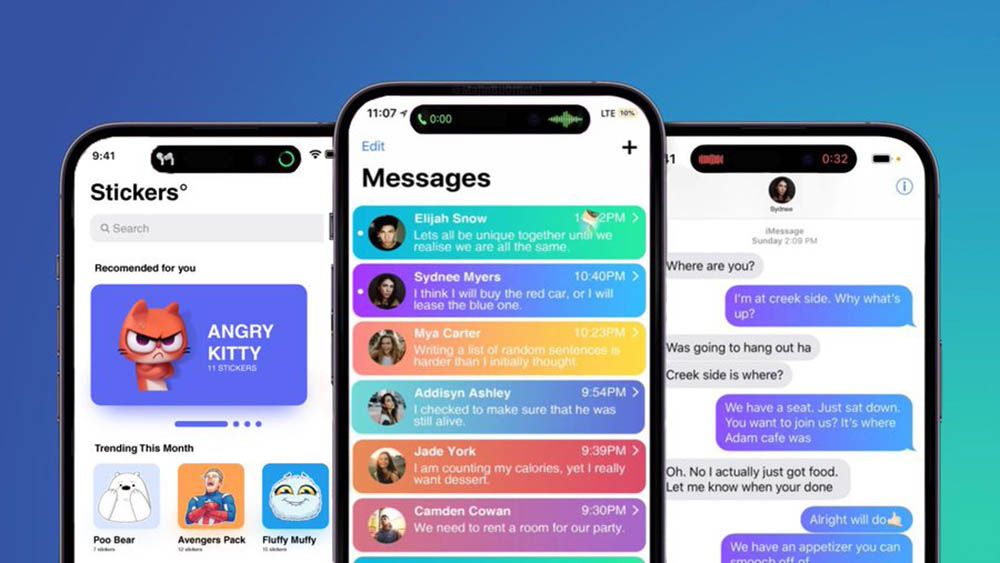
Apple is once again in the spotlight and has just been accused of making iMessage more readable than Android messages.
The blue/white of iMessage has a higher contrast than the green/white of Android. The greater distinction between light and dark results in more readable text. The increased readability translates into a better messaging experience for iPhone users versus Android users.
Interestingly, the green/white colour scheme scores “very low” in the Web Content Accessibility Guidelines (WCAG) with a value of 2.18, which affects the user experience, especially for those with visual impairments.
Sigue toda la información de HIGHXTAR desde Facebook, Twitter o Instagram
You may also like...


