It’s a fact: the monogram is back, stronger than ever. Most designers are opting to include this visual element in their garments and thus emphasise the prestige of their brands.
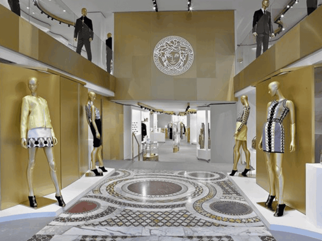
On 5 March, Versace not only presented its FW21 collection, but also welcomed a new era in the history of fashion in which the monogram is the protagonist.
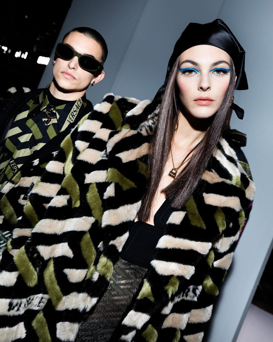
Donatella Versace has decided to put an end to the baroque prints, Medusa and archival patterns that we were so used to in favour of the Greca Pattern. It is a V-shaped design that we can see included in many of the garments of the new season and available in a wide range of colours and fabrics.
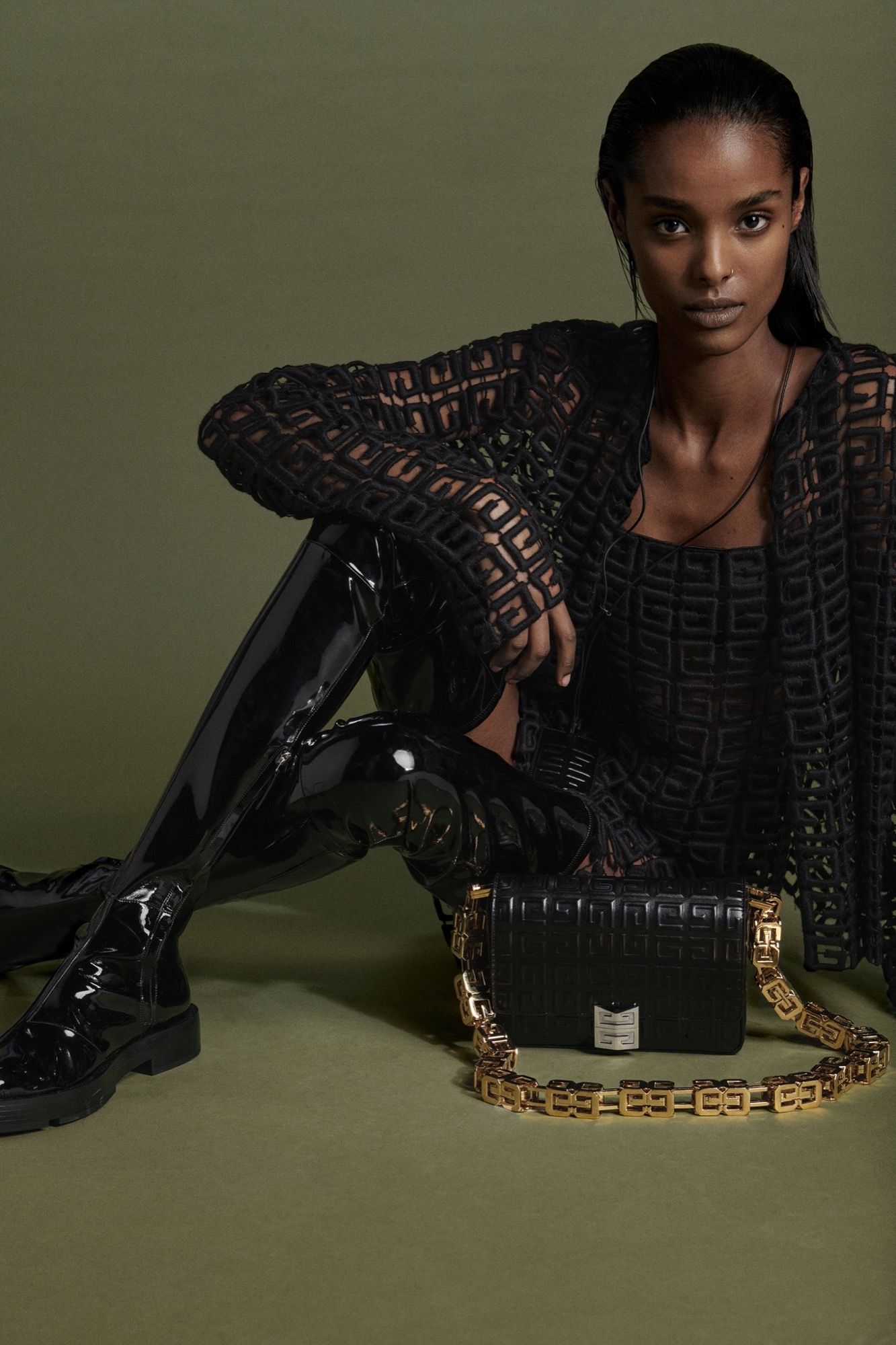
But Versace is not the only brand that in recent seasons has decided to renew its visual codes and aesthetics. Balmain revived the PB print that Pierre Balmain designed in the 1970s in honour of his initials. He did so during the SS21 collection, where he included it in his garments in small black and white stripes. This same pattern reminds us of the one used by Matthew Williams, Givenchy‘s creative director, reinventing the logo through the use of a repeated and inverted G.
Although all these decisions are motivated by an aesthetic factor; it is important to note that the main reason for the change is strategic in nature. Jonathan Akeroyd, CEO of Versace, acknowledged that this visual transformation was aimed at increasing the volume of sales, especially in accessories. The monogram sells and brands such as Louis Vuitton, Gucci, Dior, Hermès and Chanel know this. Moreover, it is worth noting the importance given to the visual codes of the great maisons; and both monographic prints and logos are the main weapon to demonstrate the reputation and worldwide recognition of a privileged sector.
But this is nothing new. We have to go back to the seventies to see the first moves towards rejuvenating brands, heralding the beginning of a new era.
Don’t miss the latest fashion news, available on our website.
Sigue toda la información de HIGHXTAR desde Facebook, Twitter o Instagram
You may also like...
